By Nancy Rausman
April 15, 2015
SYNOPSIS
Your web site can be a powerful tool to increasepatient visits. Fine-tuning four areas makes that happen.
ACTION POINTS
USE SITE AS DISPLAY CASE. Reflect your unique practice brand and include details about staff, services, location and business hours.
ANSWER: WHY CHOOSE US?Convince site visitors to complete an action–fill in a form, call your office, send an e-mail, to become a patient.
MAKE SITE AN EXTENSION OF OFFICE. Enable patients to interact with your office by enabling them to fill out forms ahead of time, book appointments and order contacts.
MAKE USER-FRIENDLY. Provide easy-to-find contact information on every page, and have clear headings and page titles.
Your practice web site is a powerful toolwith the potential to engage existing patients and bring new ones into your door, as well. The key is to make your site clear, comprehensive and user-friendly, specifically by fine-tuning four areas. You or your office manager can make improvements yourself, or contract with outside services with experience in making measurable increases in appointments.
My company, EyeCarePro, manages hundreds of web sites, and we often encounter practices with attractive web sitesthat fail to answerbasic questions any consumer would have, and make it difficult to see thelogical action step: making an appointment. As the examples below illustrate, theseproblems are fixable, whether you do it yourself or access outside expertise.
Make Your Web Site Into a Practice “Display Case”
Studies show that consumers make a decision in about one second as to whether what they see online is pertinent to their needs–or they click out. Your web site needs to deliver a clear message in that time frame. Users form an instant impression about your practice purely from the photos and the content on your homepage. Take a look at the following practice web sites, and see how the design of the site creates a positivefirst impression.
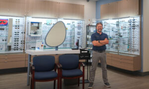
Your web site should accurately reflect the unique image and personality of your practice so patients receive a consistent message. To start, it must include thorough details about your staff, services, location and business hours. Anyone visiting your web site should have a clear picture of who you are and what you are offering. Include photos of your space, staff, equipment and products.
Including the details of your practice on your site also is essential for search engine optimization (SEO). The information (specifically your name, address and phone number) must be consistent across the web (on business listings, social media, website, etc.). This helps the search engines by adding additional consistent information about your practice, which confirms to Google that you are a legitimate business deserving of more SEO “power.”
Many studies show that photos and videos increase engagement, and we know that an accurate representation of your business (meaning people are finding what they are looking for) on your web site increases engagement and conversion and decreases bounce rate.
Design your site to create a sense of the “feel” of your practice. The colors, font, images, and overall style of your web site, should represent the personality of your practice, just as the interior design of your brick-and-mortar practice would.
Finally, the design of your web site should take into consideration the type of clientele you attract, and therefore, the type of audience you want to attract. A lot of this has to do with your location, services and specialties, for example:
Family-centered practice: Your web site should show images of patients of all ages, and include content that mentions children and family eyecare needs. The design should be welcoming and warm with many happy faces.
High-end optical: Your web site should have a modern, sleek design that highlights your product line and appeals to your target audience. Images should show models in fashion-forward eyewear designs, including designer logos, and the color scheme would likely be darker and more elegant.
Medical eyecare specialty: Focus images on your cutting-edge equipment, eyes and your medical expertise. Include details about your professional experience and training, and educate visitors about eye health.
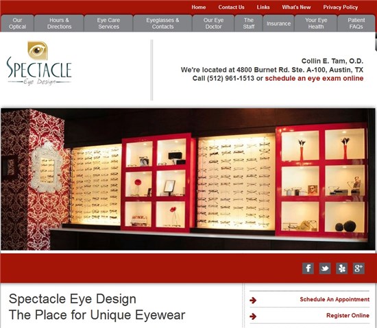
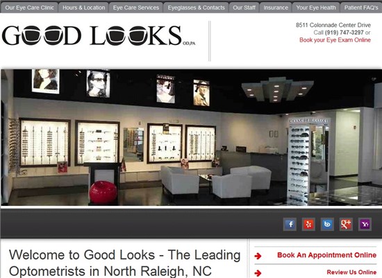
Here are some examples of practice web sites that do a great job using their site as a display case for their practice brand.
As you can see (below), the color and design scheme for Spectacle Eye Design’s site matches the interior design of the optical store.
Good Looks not only mirrors the colors, but the open spaces, of their physical location. Both sites also incorporate many location pictures into their image slideshow.
Answer the Question: “Why Choose Us?” (Your Unique Selling Point)
Your web site is a sales tool, and the goal is make a sales conversion. This means that you need to convince site visitors (prospects) to complete an action–fill in a form, call your office, send an e-mail, or take another action to become a patient. Before prospective patients will act, however, visitors need to know why they should choose you.
Your web site gives you the opportunity to differentiate your practice from the competition and show them your unique benefits, or as we say in marketing language, unique selling points (USPs). Assume that your visitors have many other options, and this is your one (short) chance to win them over. You need to explicitly and clearly TELL them why you are the number one choice.
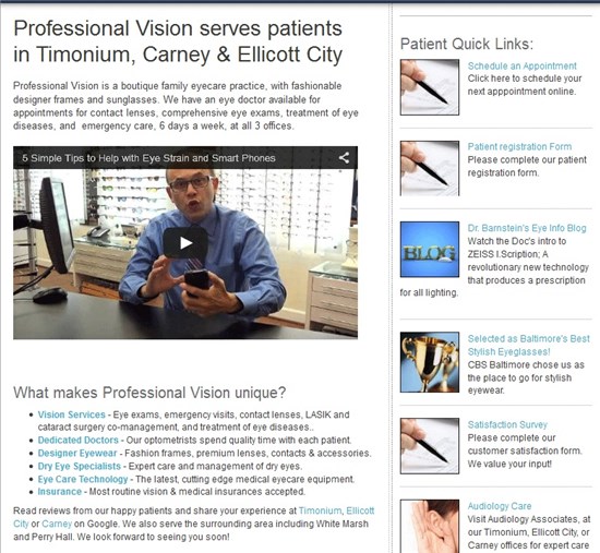
Professional Vision asks the question: “What makes Professional Vision different from other eyecare offices I’ve been to?” and then proceeds to answer it with bullet points of their USP.
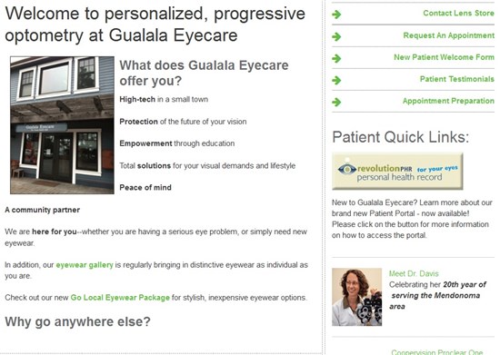
Gualala Eyecare takes a similar approach, asking “What does Gualala Eyecare offer you?” and ends with “Why go anywhere else”?
Testimonials from current patients also help to impress prospects. The language of the web site content helps to sell the practice, and answers the question, “why choose us?”
Make the Site an Extension of Your Office
Patients should not only be able to get to know you and your USP from your web site, but they should also be able to interact with your office. Including time-saving forms that enable visitors to easily book appointments, order contacts, and contact the office from the site, is an extremely effective way of engaging visitors, especially existing patients. This type of convenience is becoming standard in the industry, and patients expect to be able to access certain services online. It also gives existing patients a reason to visit your site and stay connected to your practice.
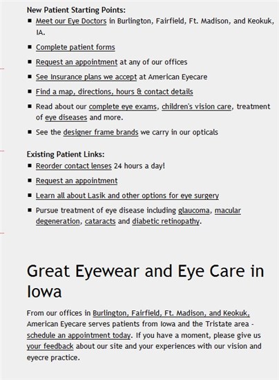
American EyeCare has an entire section of the homepage dedicated to assisting new and existing patients. The first section, New Patient Starting Points, includes links to all of the most important information and forms a new patient would need to get started, including eye doctor bios, patient registration forms, appointment request forms, location information and brand pages. The Existing Patient Links section includes appointment forms and forms for reordering contact lenses. Links to leave a review, patient history forms, and information about selecting frames, are also highlighted on the homepage.
Engaging, Easy to Navigate & Provide Relevant Info
Statistics show that the longer visitors are engaged on your site, the higher your conversion rate (more patients call or make appointments). What is the key to engaging visitors? Providing them with the clear and easy-to-access information they are looking for. Make your web site accessible and interesting, and visitors will stay, but give them one minute of frustration or confusion, and they are likely to move on to the next practice web site. Here are a few details that play a role in increasing engagement:
? Provide contact information on every page.
? Have clear headings and page titles, so visitors know where they are and can easily see where they want to go.
? Keep content succinct, grammatically correct, easy to read and informative.
? Make sure your pages load quickly.
? Make sure all of the basics are available and easy to find: doctors’ names and bios, practice address and contact information, hours, insurance policies, etc.
? Make sure your forms (appointment scheduling, registration, contacts order form, etc.) work and are visible and accessible
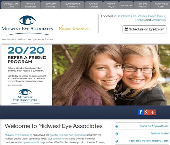
Midwest Eye Associates has an engaging and easy-to-navigate site design. The layout is clear,and information is accessible and easy to find.
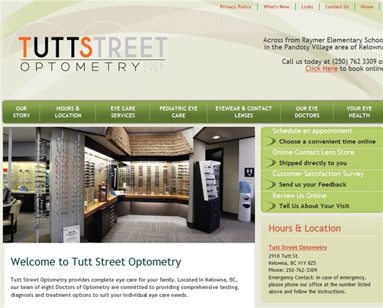
Tutt Street Optometry creates engagement by using bright colors, video and attractive images, and a clear navigation system to keep users moving through the site.
If you aren’t sure how user-friendly and accessible your web site is, have friends, family, or even patients, give you feedback. Just as you want your patients to feel comfortable, and “in good hands,” when they come in for an appointment, you want to establish that same trust in your virtual office, as well.
Nancy Rausman is the managing editor at EyeCarePro. Nancy is responsible for providing ECPs with educational content that helps them advance their practices through technology, management strategies and digital marketing. EyeCarePro is one of the leading providers of online marketing and practice improvement services in the industry. EyeCarePro serves both industry and practices and is the only company of its kind solely focused on the optometric space. To contact: nancy@eyecarepro.net